Highlight versus pipe linking
Claim
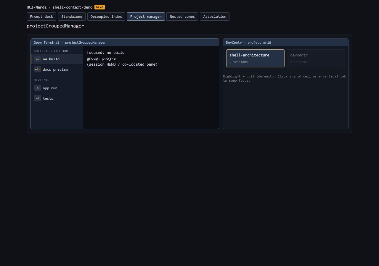
When a controller surface and a map/grid surface must show the same selection, highlight the target and dull the rest before drawing a decorative connector between windows.
In plain language: selection dimming is the everyday language of "this one"; a pipe is a special effect.
Context
OpenShellOrg / DevCentr: a project-grouped terminal manager (vertical tab groups by spawn-project) sits beside DevCentr’s project grid. Focusing a session should answer: which project cell does this terminal belong to?
Product spec: devcentr-terminal-manager @ shell-architecture.
Two options
| Pattern | What the user sees | Cost / risk |
|---|---|---|
Highlight + dull (default) |
Active project cell/tab is emphasized; siblings lose contrast or saturate down. |
Cheap; works across monitors and when windows do not share an edge; matches OS and IDE selection idioms. |
Visual pipe |
A connector from manager chrome edge into the grid item / thumbnail edge. |
Fancy; needs geometry, z-order, multi-monitor math; can compete with content; prior art for "window piping" was not found in-hive. |
Recommendation
-
Ship highlight + dull as the default association cue.
-
Keep pipe as an optional flourish after association + highlight are solid.
-
Let the user swap focus from the grid (click another project) as well as from manager tabs — the link is bidirectional selection, not a one-way animation.
Why highlight wins first
-
Working memory: contrast change is a known "focus" signal; a novel connector must be learned.
-
Failure modes: pipes break when windows overlap, minimize, or sit on separate displays; highlight still works on the grid alone.
-
Clutter budget: grids already carry thumbs and badges; a permanent pipe adds ink without adding control.
Demo
Interactive mock (highlight + dull): shell-context-demo · Project manager.
Related HCI
-
Spatial web windows — separate surfaces, shared selection via channels (not drawn wires).
-
Project inbox — grid of parallel work; selection/dimming cousins.
-
Contained tiling — zones inside app chrome (cousin placement pattern).
-
Labels versus wires (An alternative to URLs) is a different claim (identity vs pretty names) — do not conflate with on-screen connector graphics.