Edge Bar
Edge Bar puts thin bars on the top edge, left edge, or both that act as a nav substrate for an ecosystem of platforms or modes. On hover they widen enough for a label (or, in a mature system, stay unlabeled — color alone signals “this edge summons context”). On click they open a full wireframe navigation interface between platforms — instead of stuffing subsections into the content header.
In plain language: streets under skyscrapers, not streets painted on the roof.
The thinking name is context rails (page slug and repo stay context-rails).
Variants are Map Edge, Modal Edge, and Path Edge.
Variants
The edge affordance is shared (thin top/left presence, hover expand). If top and left are the same nav type, hovering either edge expands both — they present together. Labels stay on the top edge (readable). Do not rotate type on the left.
What happens on click, and what the idle color means, splits into variants worth holding side by side:
| A — Map Edge | B — Modal Edge | C — Path Edge | |
|---|---|---|---|
Metaphor |
Streets under skyscrapers; summon a street map |
Windows on windows; current activity is the top-most sheet |
The edge is a path trace — a candy-stripe of the hops you took |
Edge means |
“Open ecosystem navigation” |
“This node’s identity — peel back the stack” |
“This is the path you took in the org tree” |
On click |
Full wireframe / directory |
Slide the sheet; colored ancestor layers behind |
Jump to that path node (level), then work in it |
Color |
One overlay per platform while you work there |
Current sheet + stacked layer colors |
A series of unique colors = this exact path (not merely “tier 3”) |
Left edge |
Same color as top; expand together; no icon toolbar |
Sheet chrome; layers underneath |
Current level top-most (one mark); ancestors compress downward |
Tension |
Great for “where else can I go?” |
Great for “what am I on top of?” |
Great for “where am I in the tree?” — weaker as a full lateral directory |
They conflict if one click must mean map and stack and path jump. Prefer explicit modes (or different edges / modifiers) while the pattern is still under study.
-
Variant B: Modal Edge · VT stack
-
Variant C: Path Edge · breadcrumb colors
Path Edge notes
Idle rails show the path as color segments (Google-shaped depth: Home → Cloud → Console → Billing → Accounts — use your own tokens; primary brand colors can seed early hops without forcing “every app = one brand hue”). A unique sequence identifies the path even when two apps share a hue.
Hover:
-
Top — horizontal text labels only (no vertical / rotated type)
-
Left — one mark per level (not a sidebar of in-app destinations). Current level sits at the top-left so you see where you are first and the corner stays clean
-
Icon soup is a non-goal: icons rarely carry meaning alone; a cue word under an enlarged icon mostly helps as a shape combo. Here the user needs to identify the level and enter it. Background color per hop does that memory work; at most one mark per hop
Depth:
-
A length ceiling. Segments that fit stay conventional; only the ones that would run off are log-compressed into a reserved end-zone
-
Left sequence is root→leaf, bottom to top, whether the pack sits at the top or the bottom of the edge
File-explorer trees grow downward (root at top). Path Edge inverts that on the left on purpose: you want the current mark first.
Core claim
Many cloud consoles and suite entrypoints embed new platforms inside the old one’s chrome. The new surface overloads the entrypoint design language instead of making clear which platform owns the current context.
Designers keep parking subsections in the top navbar. That nav is ephemeral, ugly when dense, and illogical: it sits on top of the content, when navigation is really the substrate for access to different activities.
Preferred shape:
-
Content stays the skyscraper — the activity UI fills the plane; local page chrome stays local
-
Rails live at the edges — top and/or left (same or different context types) as summonable streets
-
Hover expands the pair — if top and left are the same nav type, either hover presents both; labels on the top edge only
-
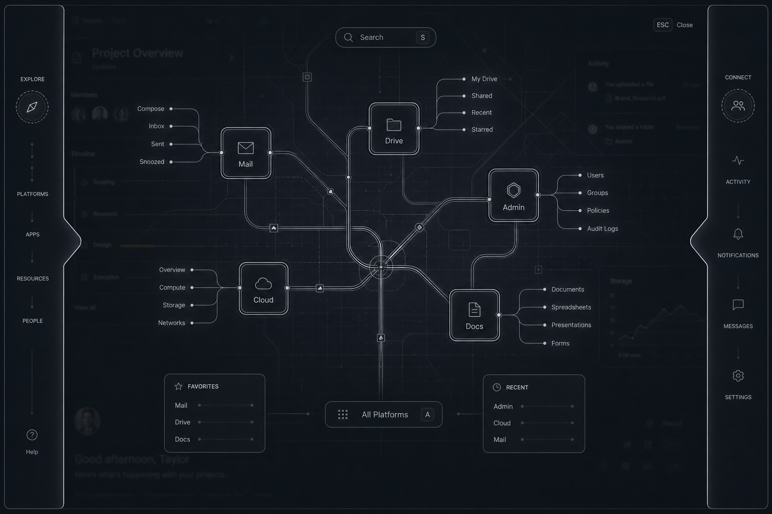
Click opens wireframe ecosystem nav (Variant A / Map Edge) — a dedicated substrate UI, not another header row
-
Or click reveals modal ancestry (Variant B / Modal Edge) — slide the current sheet; colored layers are prior nodes
-
Or the edge is a path trace (Variant C / Path Edge) — stacked unique colors for the hops; one mark per level, current at top-left
-
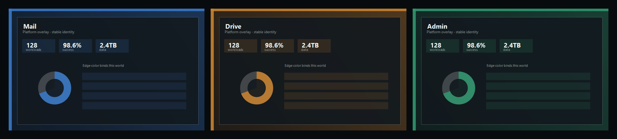
Platform / node overlay colors — stable washes so activity identity is visual and non-competing
Why it exists
Google-style cloud consoles and large Microsoft-style ecosystems make users relearn how to move between platforms because each product overloads a shared entrypoint. Reddit, Stack Overflow, and similar subsection-heavy sites push the same anti-pattern: ephemeral top chrome for roles that deserve a stable substrate.
Cities already solved the metaphor. Streets do not get summoned on top of skyscrapers. Skyscrapers are features; streets are the nav substrate at ground level.
Mockups
Streets as substrate

Circulation lives below the buildings. The buildings are destinations, not places to hang street signs across the facade.
Anti-pattern — platforms overload the entrypoint
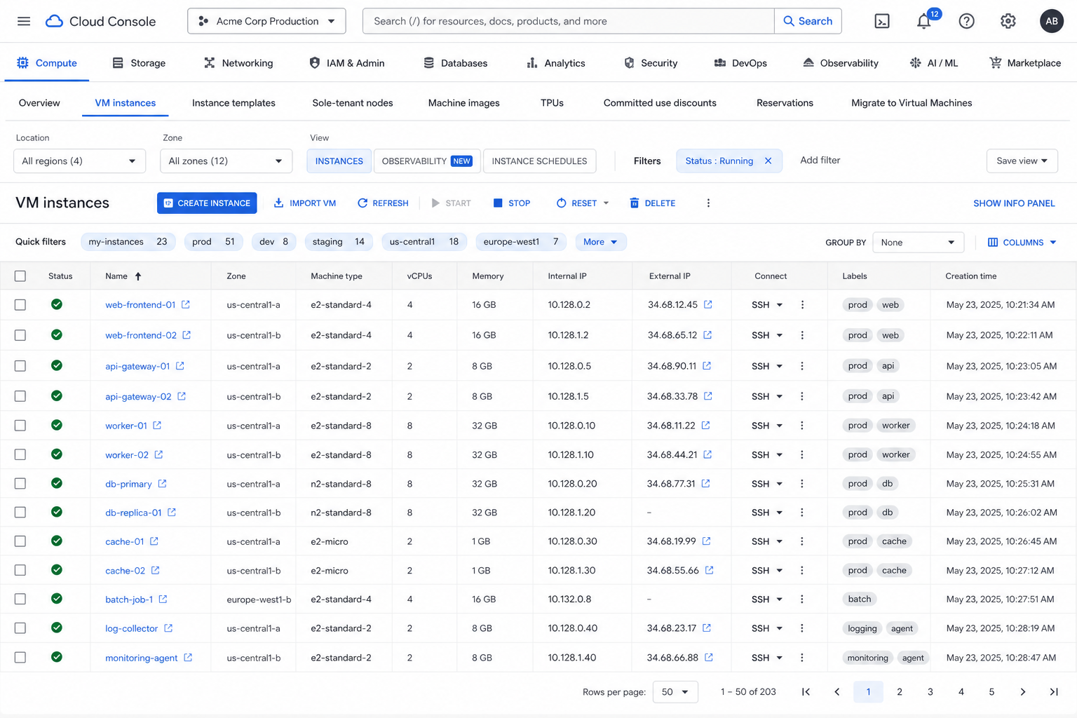
Subsection platforms compete in the header with the page they claim to serve. Context is ephemeral text in chrome, not a stable visual field.
Rails idle at the edges
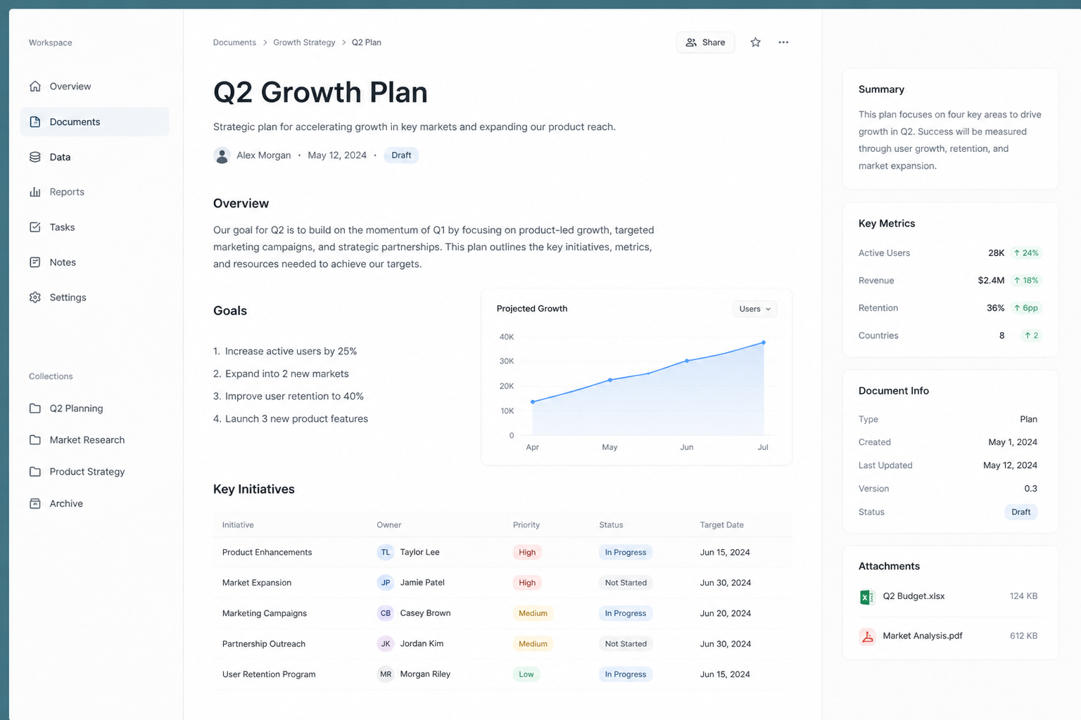
Content owns the plane. Thin edge bars hint at substrate without stealing attention.
Hover expand (same nav type on both edges)
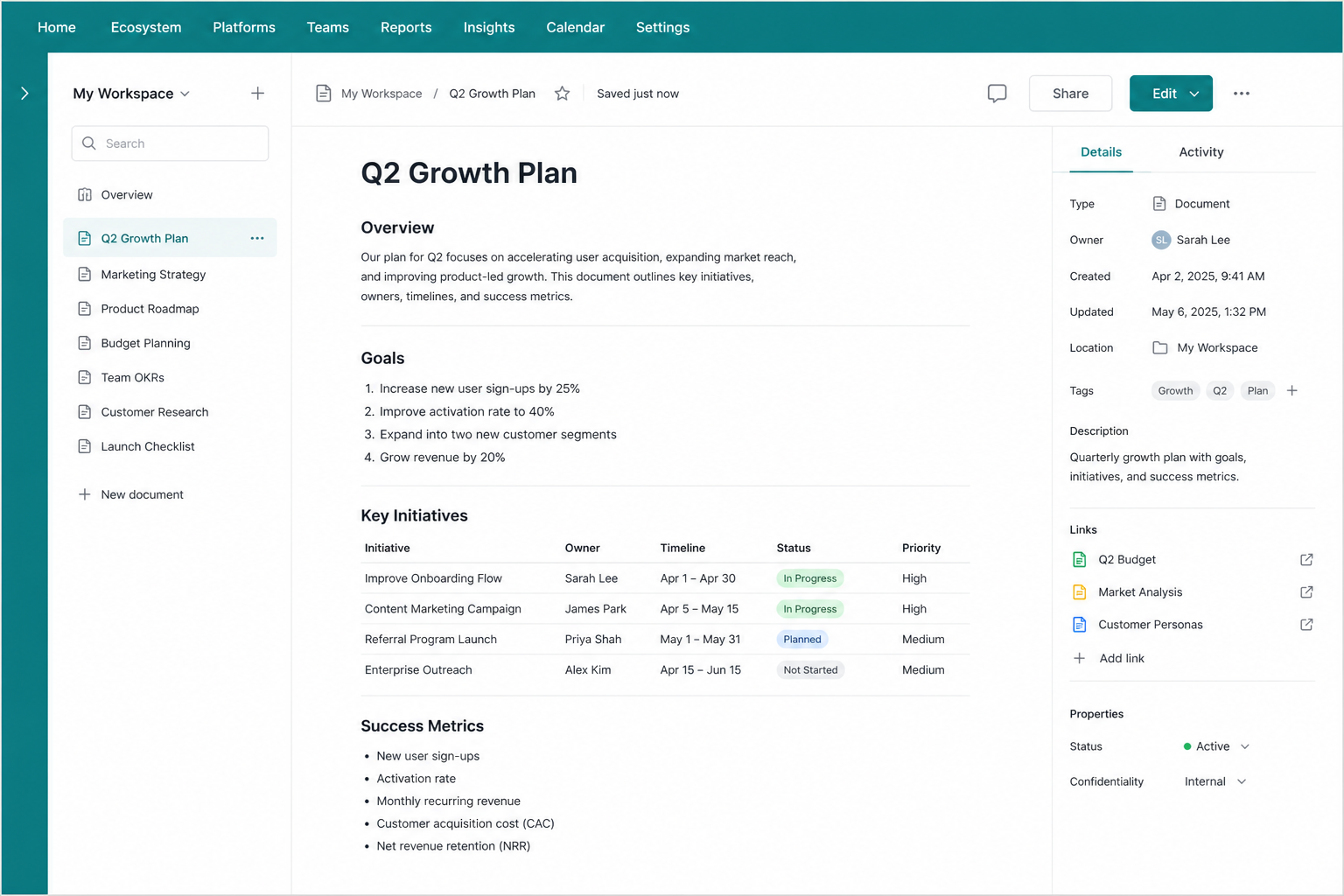
If the top and left rails are the same navigation node type, they stay the same color and they present together. Hover either edge — both expand. Readable labels live on the top. The left rail is not a conventional icon sidebar: no column of unclear glyphs pretending to be IA.
Path Edge idle — breadcrumb as color series
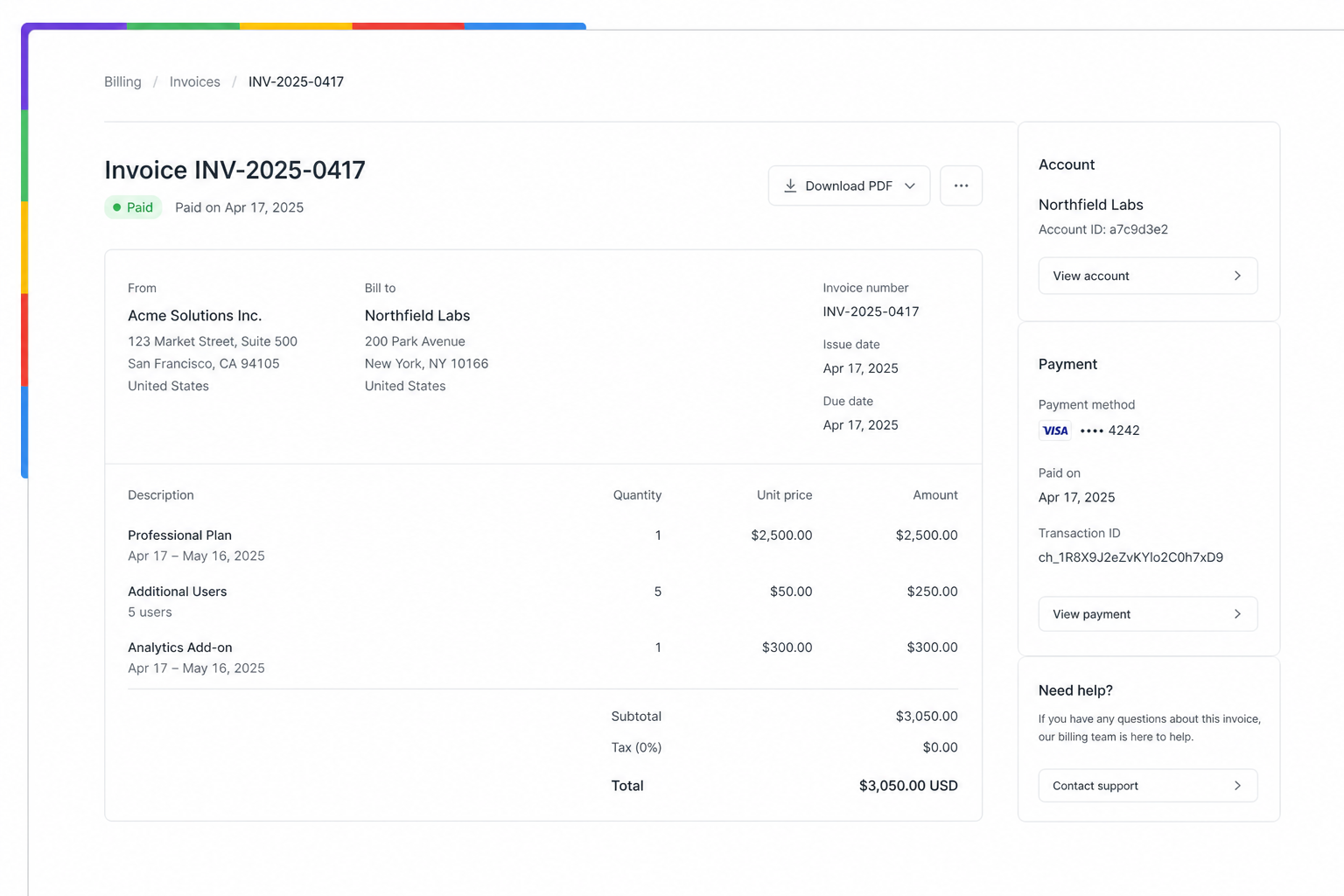
Not one wash around the frame: a series of colors for the exact path in the org tree. Orientation is instant even before any label appears.
Path Edge hover — labels on top, current mark at top-left
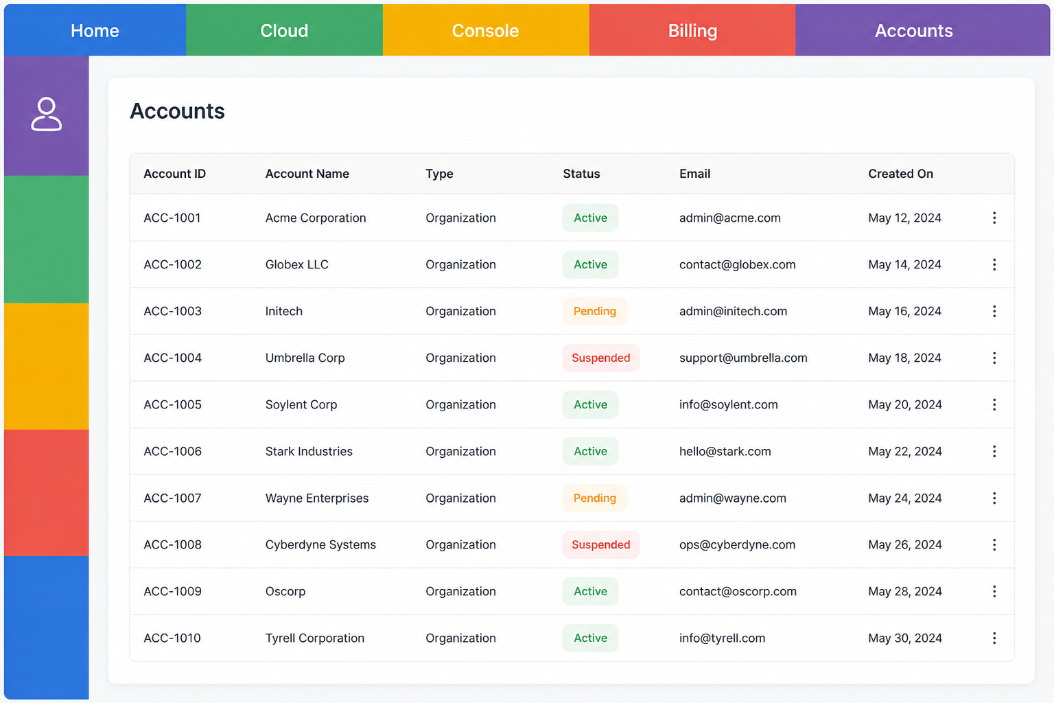
Top edge carries the words. Left edge carries one mark per hop, current level first. Click a hop to enter that level — not to hunt among in-app icons.
Edge model (sketch)
Treat rails as chrome owned by the ecosystem shell, not by each page:
-
sides—top,left, or both (optionally different context types per side) -
idleWidth/hoverWidth— thin presence vs label-ready expansion -
labelMode—text|color-only -
onActivate— A: open wireframe map; B: reveal ancestry stack; C: jump to path node -
path[].color— unique hop colors (sequence = this breadcrumb); optionalpath[].mark(one per level) -
pairHover— when sides share a nav type, hover/focus on either expands both -
labelSide—top(no rotated left-edge type) -
leftOrder—current-first(top-most = here) -
topLength/leftLength— a ceiling, not a forced fill. Hops that fit keep a conventional size; only overflow hops share a reserved end-zone (log compression). -
Left pack sits at the top or bottom of the left edge. Sequence is always root→leaf, bottom to top — not a transpose.
-
Tint is idle-monochrome (page-color greys). Hover keeps icons and the mono field; a pointer mask reveals stored hop color via a selectable blend mode.
-
activePlatform.overlay/stack[].overlay— CSS variables or theme tokens for base wash / duo-tone / layer identity
Reshape overlays on platform change, not on every in-page click, so spatial and chromatic memory can form.
Framework impedance match
Edge Bar is long-lived shell chrome with hover, open-state, and platform identity. They shine where the UI runtime can hold that state next to routed content.
| Host | Fit | Impedance / note |
|---|---|---|
Solid + SolidStart |
Shines. Signals map cleanly to hover width, open overlay, and platform tokens. SolidStart root/layout is the natural production home for the same components used in Astro islands. |
SolidStart is not required to demo the pattern; drop Solid rail components into a SolidStart layout. File routes stay content; rails stay shell. |
React + Next.js |
Valuable and portable. Client layout wrapper around |
App Router: rails must be |
Svelte + SvelteKit |
Strong for motion. Edge expand and overlay transitions are cheap; Kit layouts mirror substrate slots. |
Same shell-vs-page split as SolidStart. |
Astro (MPA / islands) |
Excellent for demos and docs sites — multiple framework islands can share one contract. |
Weak if each “platform” is already a heavy SPA that owns the viewport; then rails belong inside that SPA shell, not only the Astro layout. |
Vue / Nuxt |
Fine; diminishing returns once Solid + React + Svelte exist for a repertoire MVP. |
Same client-shell rules as the others. |
Mobile-first cramped chrome |
Poor default. |
Edge hover fails; prefer an explicit switcher pattern — out of scope here. |
Implementation notes
Shell owns rails
The activity page must not invent its own competing ecosystem tabs in the header. Local IA (in-app sections) can stay in-page; cross-platform moves go through rails.
Non-goals
-
Replacing in-app information architecture with a giant ecosystem map on every click
-
Mobile gesture design as the first target (desktop/web ecosystem shells first)
-
Cloning any vendor’s proprietary console chrome
-
Painting streets on the skyscraper (header overload) and calling it “navigation”
-
Replacing the edge with a conventional icon rail (icons as the goal; cue-words as a patch for weak glyphs)
Prototype
-
Blog essay: When platforms overload the entrypoint
-
Site demo: Edge Bar desk
-
Modal Edge demo: VT ancestry stack
-
Path Edge demo: breadcrumb colors
Literature
-
Prompt seed — context rails (2026-08-10) — originating framing (overload, edges, overlays, streets/skyscrapers)
Related
-
Principles — progressive disclosure; attention budget
-
Scoped UX architecture — many small tools under one roof
-
Context-bound settings — dependent settings beside activity (sibling bind problem)