 HCI Nerdz
When the file tree owns the first viewport
GitHub repo pages still open on empty owner CTAs and a directory dump. Visitors want the README. Progressive disclosure and sticky README | Code tabs fix the altitude without hiding real Releases.
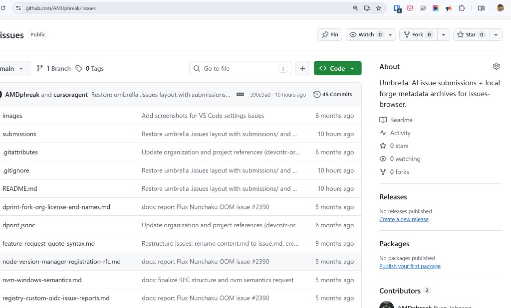
Most people who land on a GitHub repository are not there to publish a release. They are visitors: readers, evaluators, maybe future contributors. The page still behaves like a maintainer console that happens to be public.
Empty Releases and Packages keep their slots. “No releases published” is not a visitor fact — it is an owner onboarding CTA wearing the clothes of information. The About column often repeats stars, watching, and forks already in the header, and offers a Readme jump that is redundant when a README exists and wrong when it does not. Above all, the file browser owns the first viewport. The project story waits below a directory dump that owners already know how to find under Code.
That is the wrong altitude for the larger audience. Same class of mismatch as product vocabulary centered on the person who created the repository rather than people joining later — and adjacent to when the UI hides what counts.
I filed the ask upstream as Repo homepage should be visitor-first…. Outside GitHub, Anish made a related meaning-first case in early 2026: GitHub Needs a Meaning First Makeover.
What visitors actually need
Budget the first screen. Progressive disclosure is already on the principles list for a reason: deepen on demand; do not spend attention on empty chrome.
Two complementary fixes:
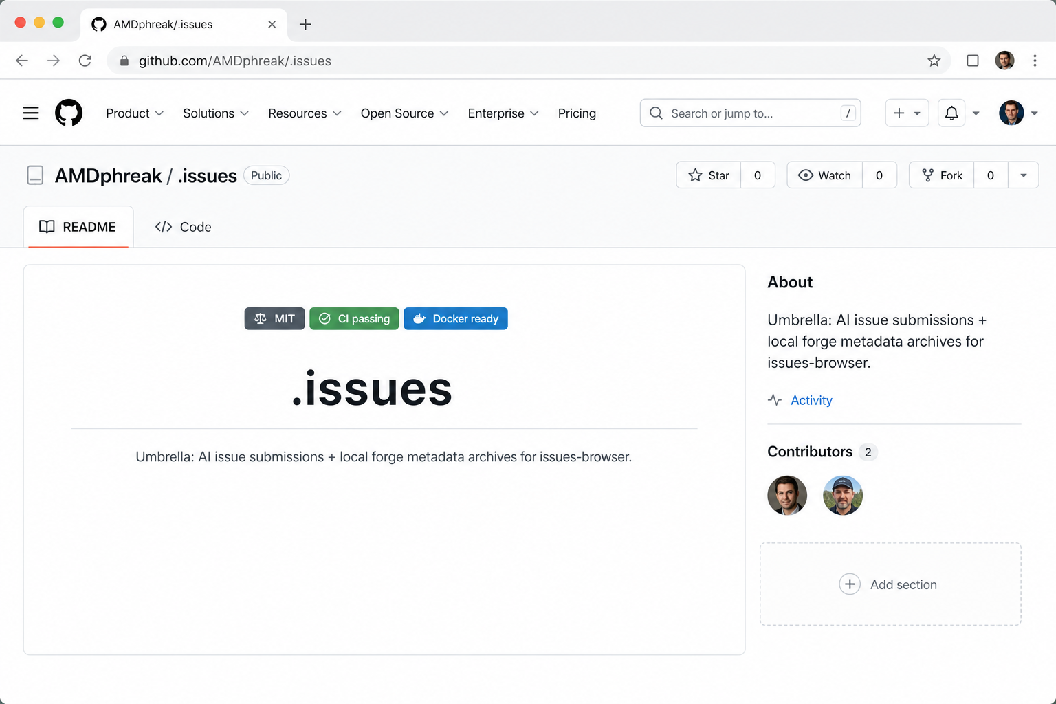
- Hide empty sidebar sections by default. Only render sections with real content. Keep a short always-on set when present — description and topics, website, Activity, Contributors — plus the header Pin / Watch / Fork / Star. Owners still need to add Releases and Packages; they do not need permanent “none yet” billboards for everyone else.
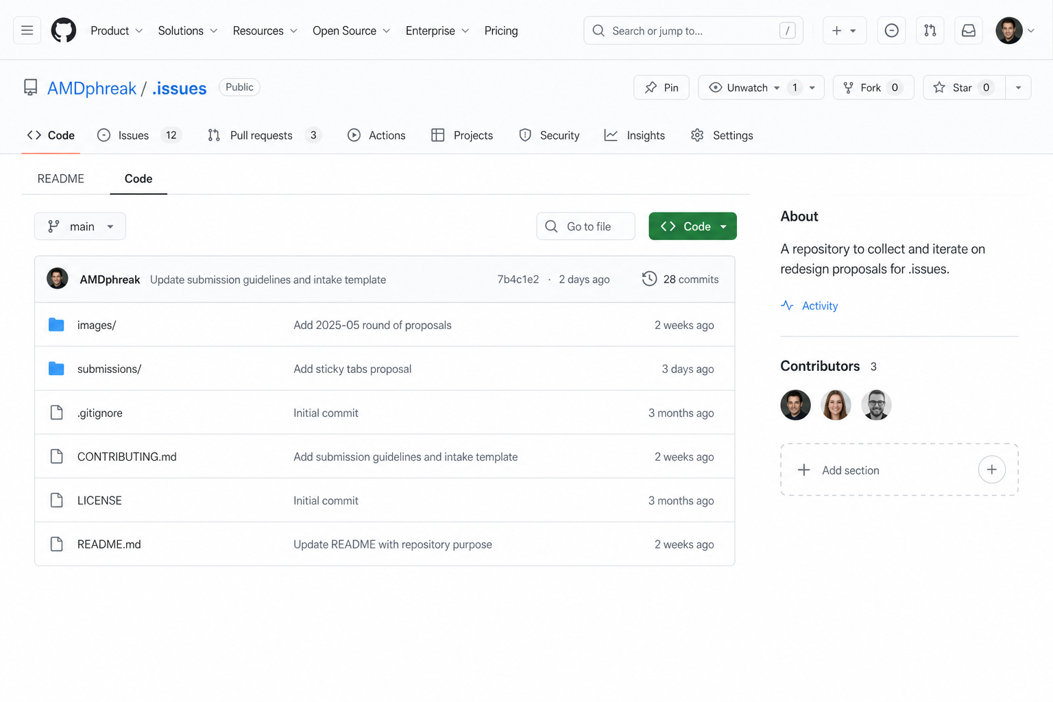
- Put README before the file tree. Sticky secondary tabs — README | Code — defaulting to README when one exists, or README above a collapsible / below-the-fold tree. Switching stays cheap. Meaning stops living under files.
Neither change removes Releases or Packages when a repo uses them. Neither hides owner tools from owners. Only default visibility and disclosure change for visitors.
Owner affordance without visitor tax
Empty space in the sidebar should not look like a broken product. It should look quiet — until the person who can fill it hovers.
A small + / Add section control on hover opens a short list of addable sections. Hovering a row expands a one-line explanation (“Releases — publish versioned binaries and notes”). That is progressive disclosure aimed at maintainers, not a second homepage of CTAs aimed at everyone.
No README → no Readme link in About. Substance over chrome.
Mockups
Each step builds on the previous. Example repo: a project with no releases or packages — the case where empty CTAs hurt most.
Current — empty Releases / Packages and files-first chrome:
Proposed — README first; empty sections gone; owner + affordance:
Same layout — hover + → add sections with brief descriptions:

Code tab — file browser when you want it; minimal sidebar retained:
Users already paper over density with Refined GitHub, GitHub-Defreshed, and friends. Workarounds prove the job. They are not a substitute for a visitor-first default.
Where to go next
The idea is the altitude: visitor meaning first, owner onboarding on demand. Recipes and the full non-goals list live in the docs — not here.
- Docs — Visitor-first repo homepage
- Upstream — Community discussion #204347
GitHub can ship the sidebar disclosure without waiting on a full layout rewrite, and README | Code tabs (or README-above-tree) as the default when a README exists. Until then, the mockups are small enough to argue from, clear enough to consolidate against sibling threads, and ready enough to belong in the repertoire.