 HCI Nerdz
Ecosystem nav at the screen edge
Suite apps stuff new platforms into the header until you lose which world you are in. Context Edge moves that travel to thin rails on the shell — wireframe maps, stable overlays, optional path color.
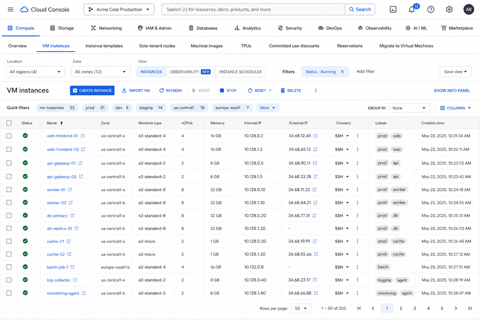
You open a cloud console to resize a VM. Before you get there, the top of the window already hosts Compute, Storage, Networking, IAM, Billing, Monitoring, and something called “Marketplace,” all fighting the page title for the same strip of pixels. Mid-task you click Storage — fine — then realize you are no longer sure which product owns the chrome under your cursor. The header did not fail at density. It failed at whose room you are in.
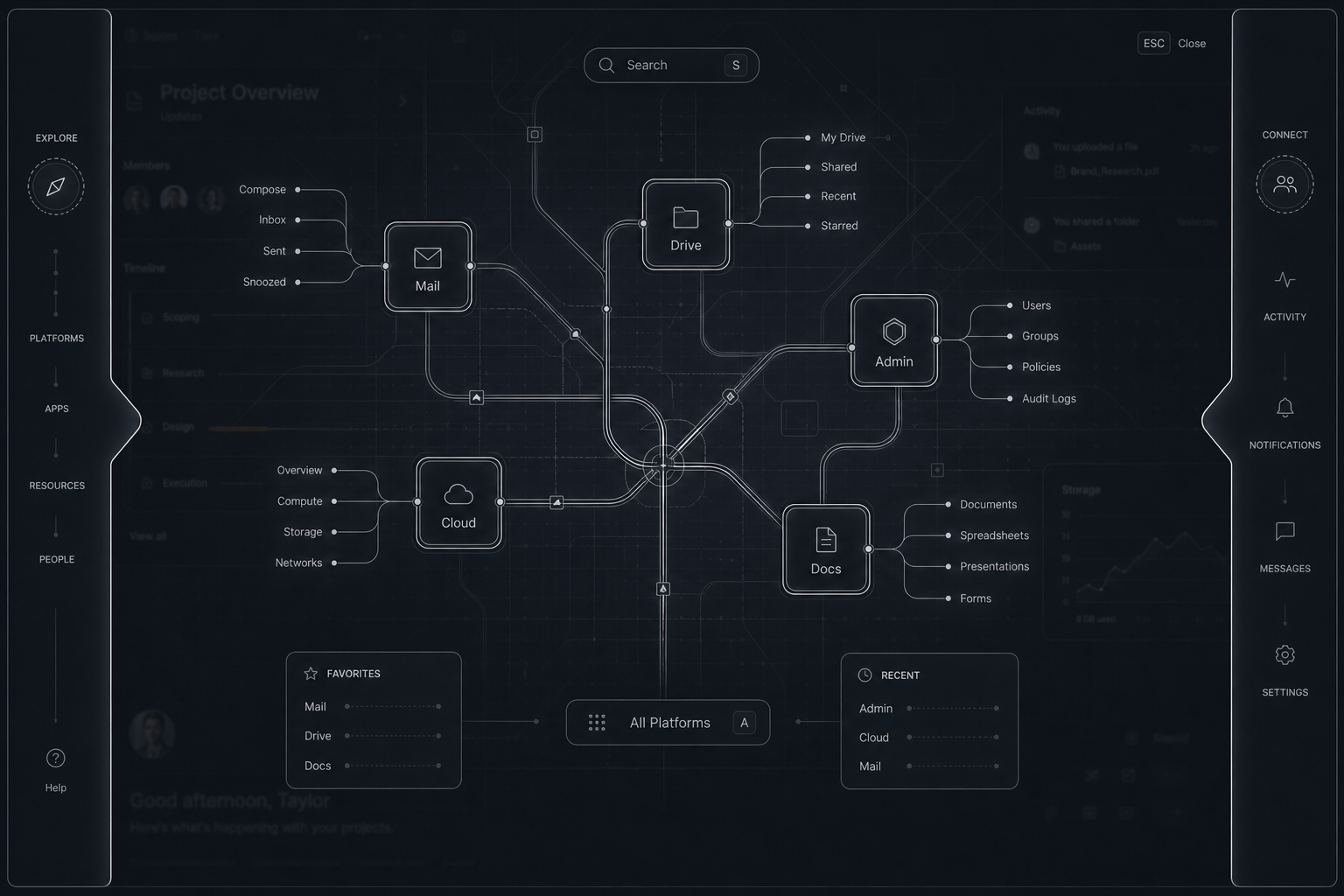
Context Edge is the fix I want for that class of product: keep the activity plane, and put ecosystem travel on the shell’s top and left edges — thin rails that expand on hover, open a wireframe map on click, and wash each platform with a stable overlay so the room itself carries identity.
The header stopped being a place
Google’s cloud console — and plenty of suite apps — keep embedding new platforms inside the entrypoint without separating design language. The new surface overloads the old one. Controls no longer say which platform is providing the current context.
Microsoft-scale ecosystems get the same disease with more buildings. Reddit and Stack Overflow shove subsection and role chrome into one ephemeral strip. Users relearn how to move because the map is never a place — it is a rotating sticker on whatever they happened to open.
Designers park subsections in the top navbar because it is the only chrome they trust. Dense, it looks desperate. Structurally, it is upside down: navigation for other activities sits on top of the activity you came to do.
Rails on the shell
Leave the page alone. Add thin rails on the top edge, the left edge, or both. Idle, they are almost nothing — a presence and a color. If both edges mean the same nav node, they share that color; hover either and both present. Labels stay on the top edge (readable). Do not rotate type up the left. A mature product can drop the label entirely: the bar alone means “summon context here.”
The left edge is not another icon sidebar. Glyphs rarely carry meaning alone; teams then stuff a cue word under a bigger icon so the shape combo becomes distinguishable. That is a patch. Here the job is to identify the level and enter it. At most one mark per level.
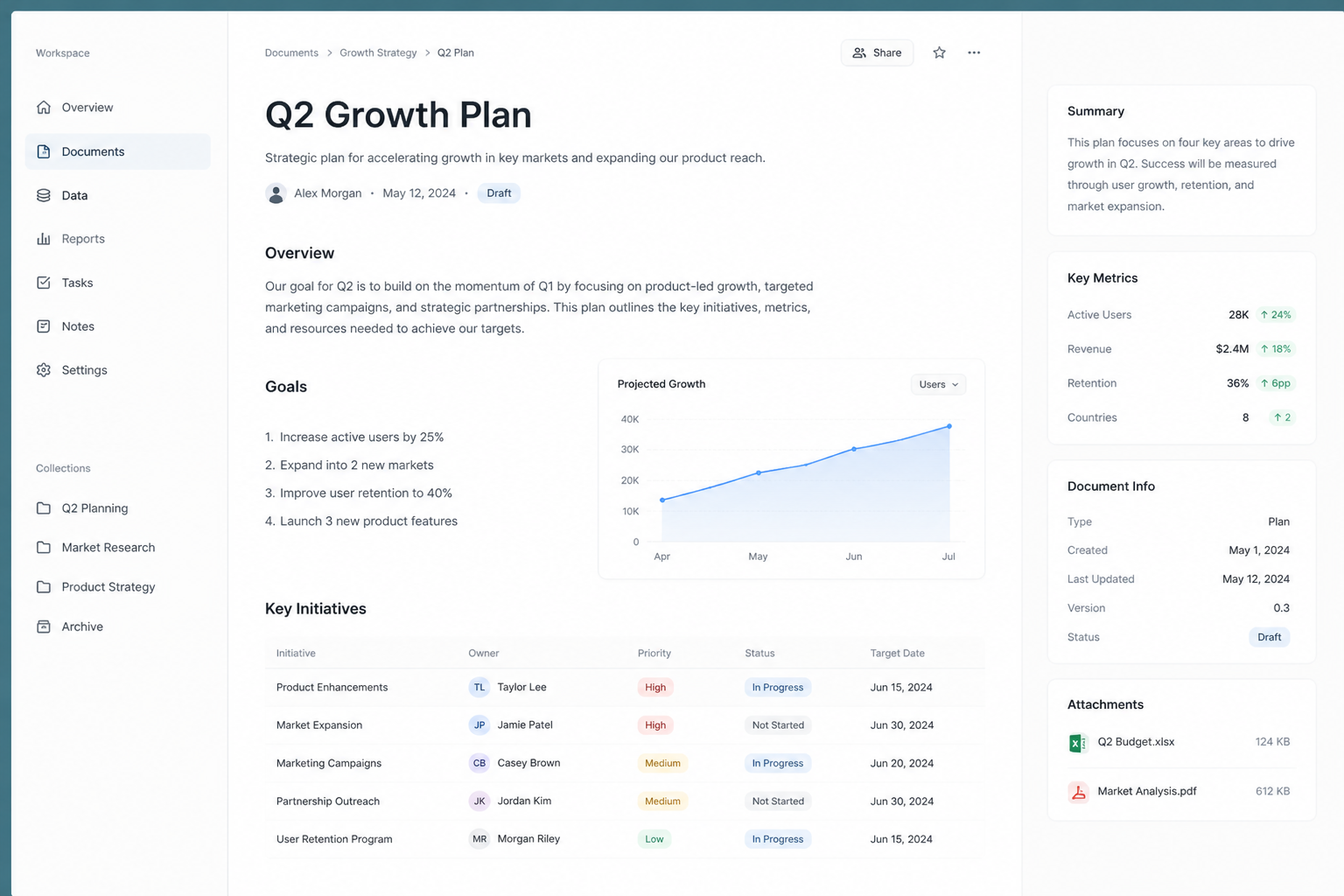
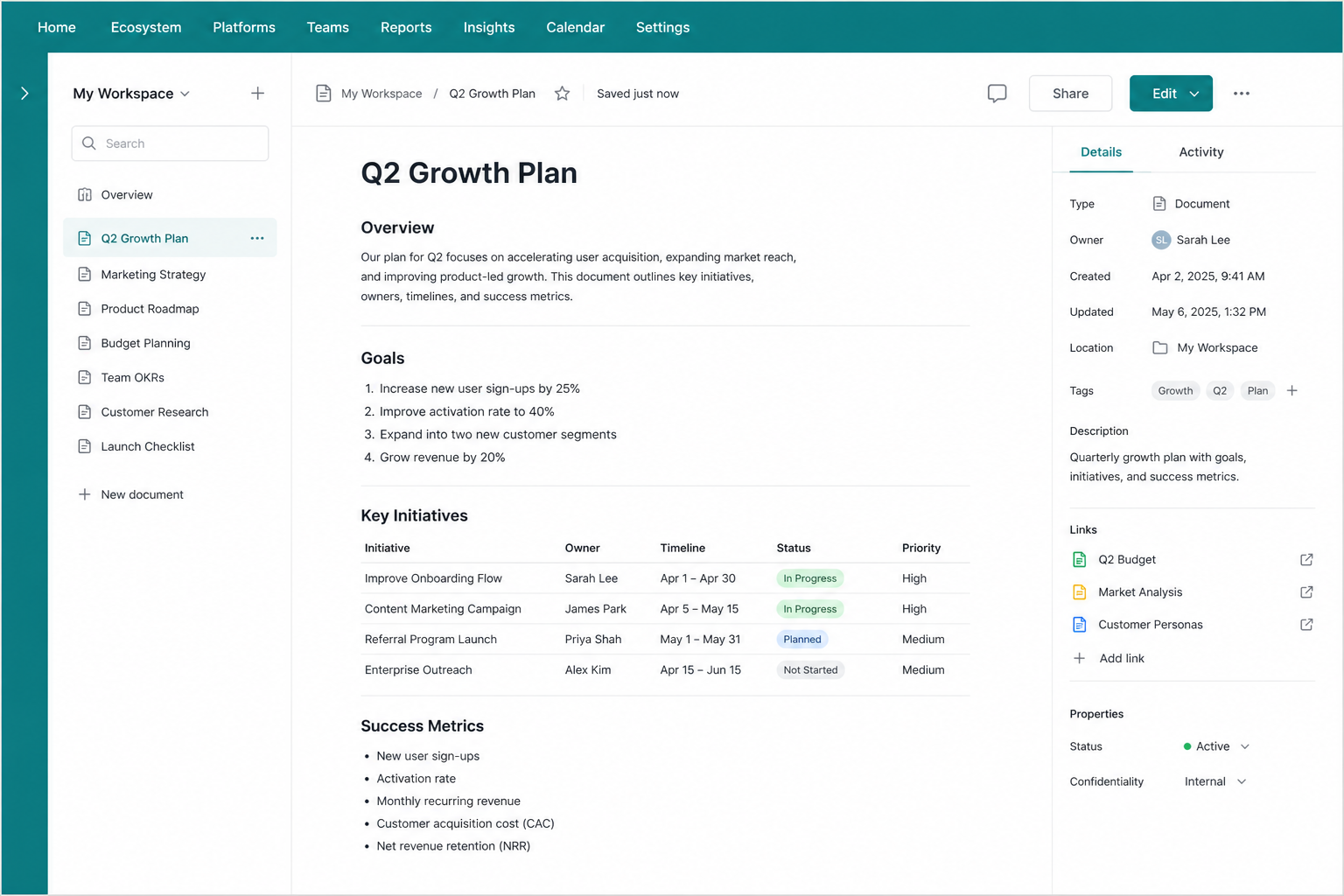
Click does not dump another row of tabs onto the header. It opens a wireframe navigation surface — platforms and modes you can traverse without relearning each product’s local chrome.
Color that sticks to the room
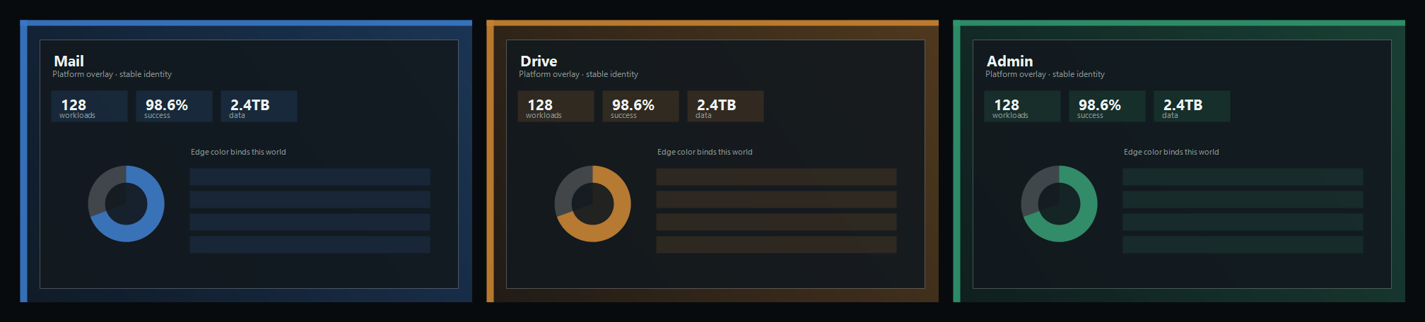
Each platform should carry a different base wash that reads as an overlay on the ultimate shell. Duo-tone and soft radials give you more identity without turning every header into a logo parade. When the wash is stable, you do not need the navbar to scream the product name on every pixel — the room already did.
Path as a color series
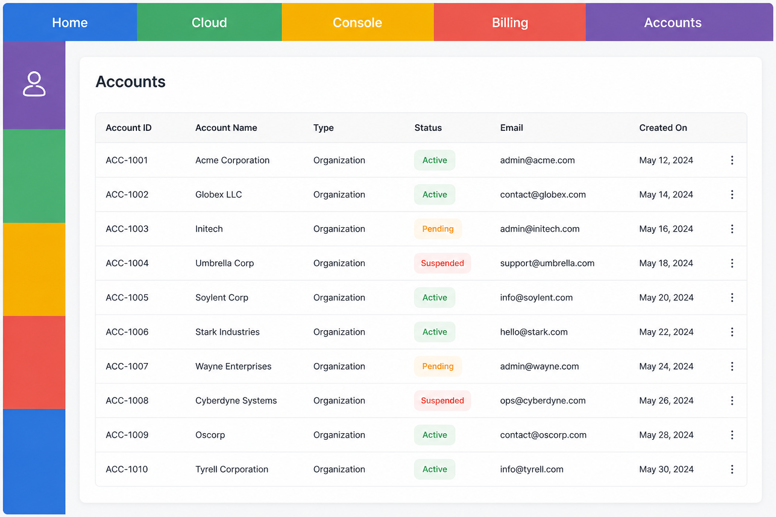
A third variant treats one edge as the hops you took — top or side, not the same hops mirrored on both. Instead of one wash, you get a sequence of unique colors for Home → Cloud → Console → Billing → Accounts (or your own tree). That sequence orients faster than a crumb string. Early hops can borrow org primary hues without collapsing to “different app = different single swatch”: the series is the identity.
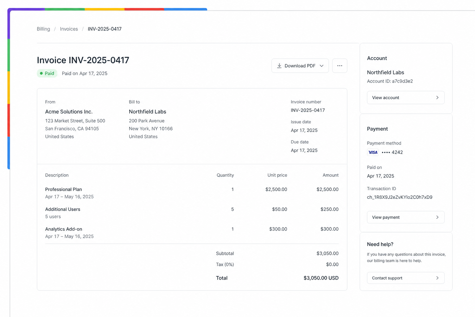
Hover expands that single full-length edge. Top placement: marks with quieter labels. Side placement: one mark per level, Home pinned at the start. When hops do not fit they overflow under Home — drag or swipe to scroll them out. File explorers grow downward from the root; Path Edge keeps Home as the sticky entry while the current hop trails toward the far end of the rail.
What has to be true underneath
Rails belong to the ecosystem shell, not to each page’s DIY header.
- Shell chrome owns edge sides, hover expand, and the wireframe nav.
- Platform registry carries id, label, route/entry, and overlay tokens.
- Activity UI stays local — in-app sections can remain in-page; cross-platform moves go through rails.
- Keyboard and explicit activate matter — hover expand is desktop progressive enhancement, not the only door.
You still get progressive disclosure: the map is available without living permanently on top of the work.
Where to go next
- Docs — Context Edge
- Desk — Context Edge desk
- Demos — Map / Modal / Path implementations · repo
- Path Edge — breadcrumb colors
- Sibling — Making settings follow the activity (bind settings to activity; rails bind platforms to the shell)